The Eye Doesn’t Lie
Visuals and details have been modified to respect confidentiality. Contact me for further context.
Client Industry
Healthcare · Ophthalmology
My Role(s)
UX Researcher · UI Designer · Front-End Developer
Project Focus
Website Information Architecure and Visibility
Tools/Methods:
Microsoft Clarity
Informaiton Architecture
Google Analytics
UI Accessibility
Problem
Confusing navigation paths led users to irrelevant pages. Excessive menu choices increased cognitive load leading to decision fatigue. Text was often overlaid on imagery, making it difficult to read—especially for a visually sensitive audience. These design choices led to early exits and poor engagement across the site.
Solution
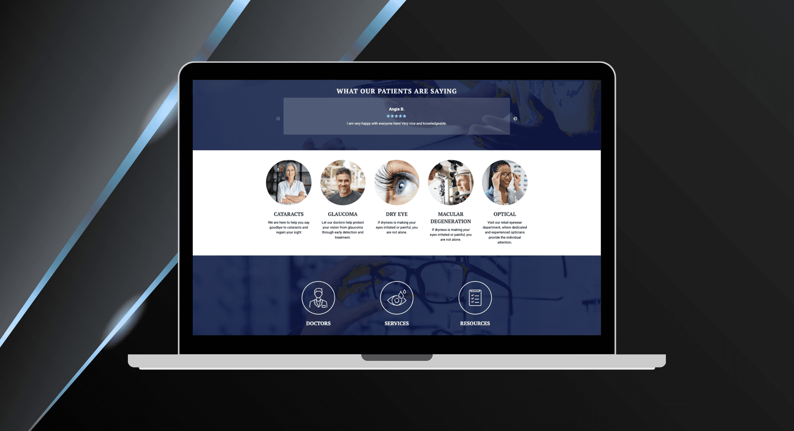
I redesigned the experience from the ground up—starting with content clarity and user prioritization. I simplified the layout, increased font sizes, used imagery with purpose (not distraction), and reorganized services around user needs. Calls-to-action were streamlined and placed with intention. The result: a cleaner, calmer interface that guided users toward care—not confusion.
Key Feature // 1
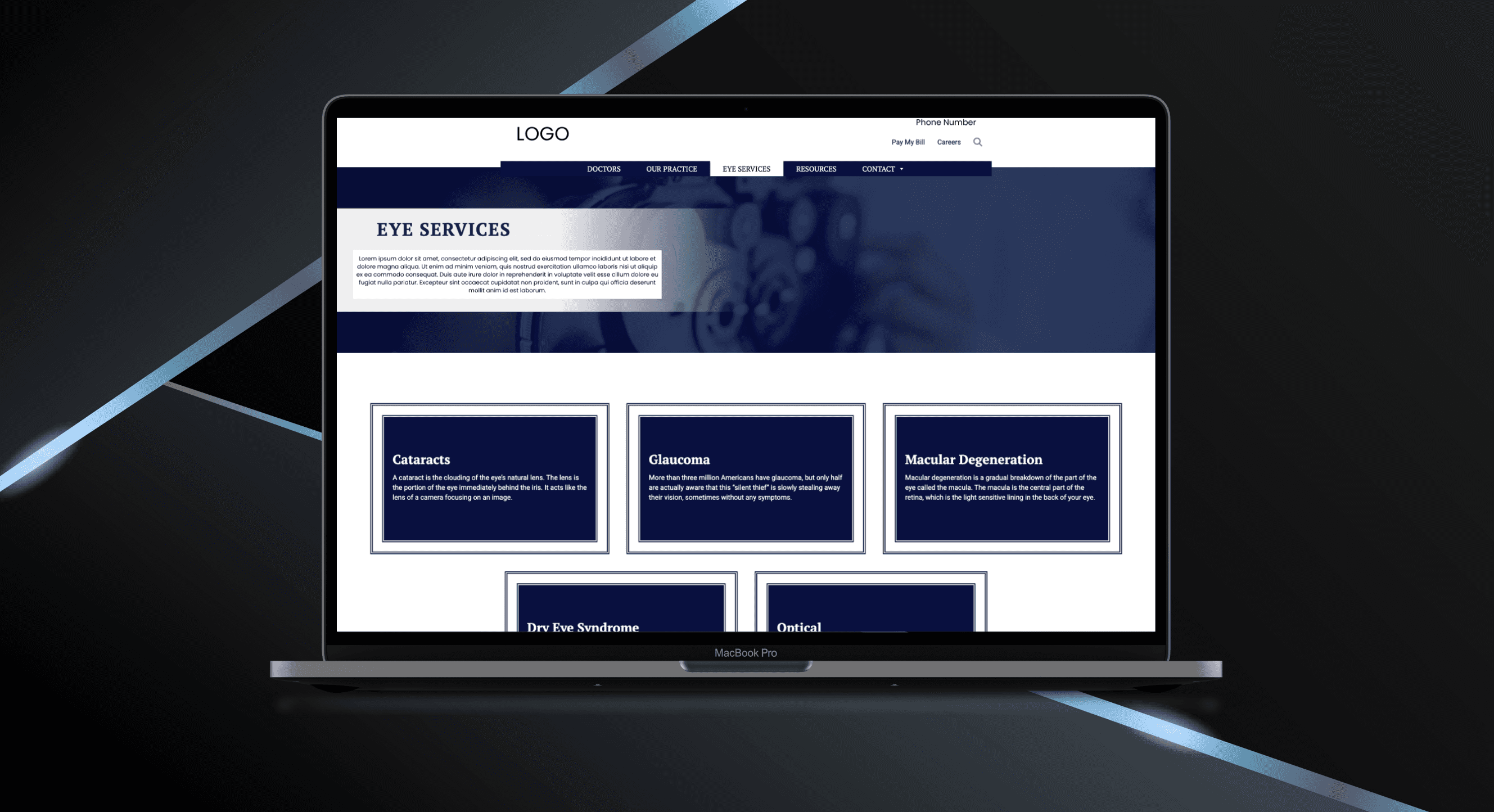
Simplified and restructured the navigation
I reorganized the menu to prioritize what users were actually looking for, removing redundant choices and reducing decision fatigue. This included renaming items, grouping related content, and focusing the layout around a single, action-oriented CTA—minimizing content overload, giving users a faster, clearer sense of direction.
Key feature // 2
Improved visual scannability
For a practice serving patients with visual challenges, the old site was ironically hard to see. Text and images were rebalanced to create a clearer reading experience—particularly important for users with visual impairments. Font sizes were increased, contrast was improved, and imagery was used to enhance (not distract from) the surrounding content. These updates made it easier to skim, interpret, and take action—without visual fatigue or guesswork.
Key feature // 3
Guided service flow to increase scroll depth
To increase scroll depth and reduce bounce, I introduced clear internal headings, better spacing, and a single pointed call-to-action. Service content was broken into digestible sections and visually aligned with one navigation path. Users stayed on track, scrolled further, and engaged longer—without feeling overwhelmed.
New site boosts engagement & intentful sessions
The redesign improved not just time on site, but the quality of time. Users navigated to more pages, scrolled with purpose, and stayed engaged—not because they were lost, but because they were guided.
7%
Scroll Depth Increase
Users are scrolling deeper into content—up 7% sitewide—indicating increased interest and reduced drop-off.
1.5x
Time increase
Longer engagement across major pages and the site in total reflects not just more time—but more meaningful interaction with content.
3.8%
Traffic Increase from Organic Search
Improved structure and SEO alignment helped more qualified users discover the site—leading to a steady rise in organic visits.
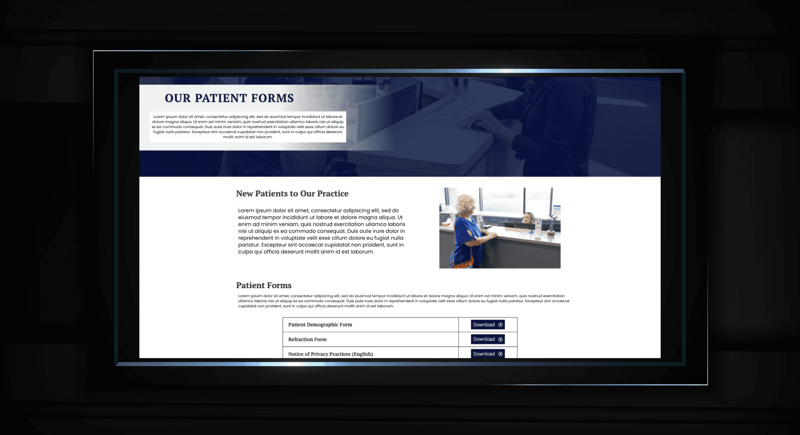
New Reorganized Forms
Conclusion
This project proved that thoughtful simplification isn’t just good design—it’s a service to the user. By improving accessibility, visual flow, and information hierarchy, we helped patients connect with the care they needed. The strongest signal? They’re staying longer, going deeper, and converting with confidence.
more projects


