
CTA Funnel Fix
Visuals and details have been modified to respect confidentiality. Contact me for further context.
Client Industry
Healthcare · Ophthalmology
My Role(s)
UX Researcher · UI Designer · Front-End Developer
Project Focus
Redesign for CTA clarity

Tools/Methods:
Microsoft Clarity
User Flow
Google Analytics
Information Architecture
Problem
This glaucoma-focused practice specializes in long-term patient care—not one-time surgeries. However, the original website didn’t reflect this focus. Key user actions—like contacting the clinic, refilling prescriptions, or accessing clinical trials—were buried or hard to find. Navigation lacked structure, CTAs were inconsistent, and visual distractions made it difficult for users to complete essential tasks.
Solution
I restructured the site to guide users toward the actions most relevant to their care journey. We introduced a cohesive overview of the glaucoma team to reinforce a collaborative care model and organized content to avoid competing with CTAs. Using funnel tracking, I identified where users dropped off or got lost, then redesigned the structure to support smoother, more purposeful interactions.

Key Feature // 1
Simplified content to support CTA clarity
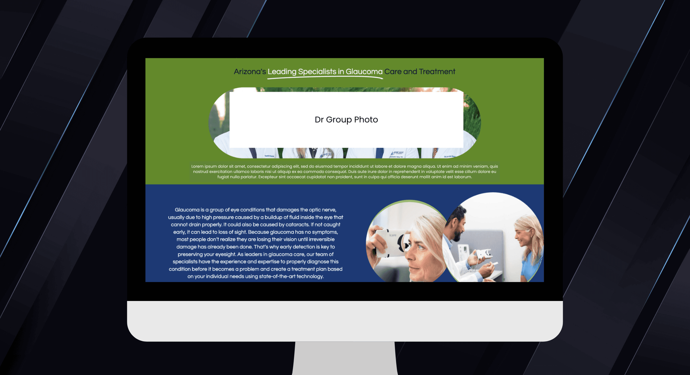
The Glaucoma page was redesigned to walk users through the care journey with clear intent. Content was streamlined to reduce distractions and emphasize the most important actions—like booking an appointment or viewing clinical trials.
Key Feature // 2
Strategic placement of clinical trials (no more pop-ups)
Previously, the main way to view clinical trials was via a pop-up—one that had a 0% clickthrough rate. I eliminated the pop-up and embedded static CTA links at key points: midway through the homepage, in the menu, and in the footer of the glaucoma page—ensuring visibility without frustration.
Key Feature // 3
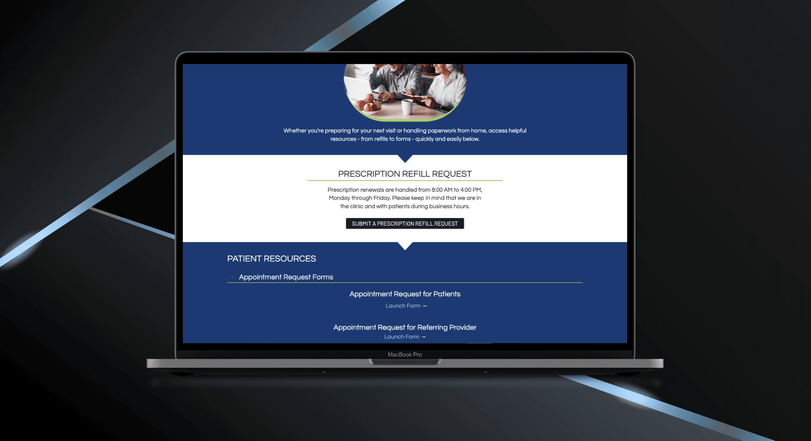
Reorganized and prioritized form access
Forms and prescription refills requests were hard to locate and cramped together. I separated these functions and moved the prescription refill form to a more prominent position. Also, adding additional spacing for the forms made it easier for users to select the correct form without error.
Results
Users are now guided to the right actions
The redesign significantly improved user flow and conversion. Clear structure and thoughtful placement led to faster decisions, more successful actions, and reduced user frustration.
100%
Decrease in Rage Clicks
All rage clicks were eliminated, indicating reduced friction and clearer user paths.
4%
Key CTA Conversion Rate Increase
Conversions from the Glaucoma page to clinical trials improved by 4%. Contact conversions from doctor profiles also rose over 4%.
3 Minutes
Quicker to Conversion of Contact CTA
The time it took for users to initiate contact dropped by over 3 minutes—showing that CTAs were now where users expected them to be.
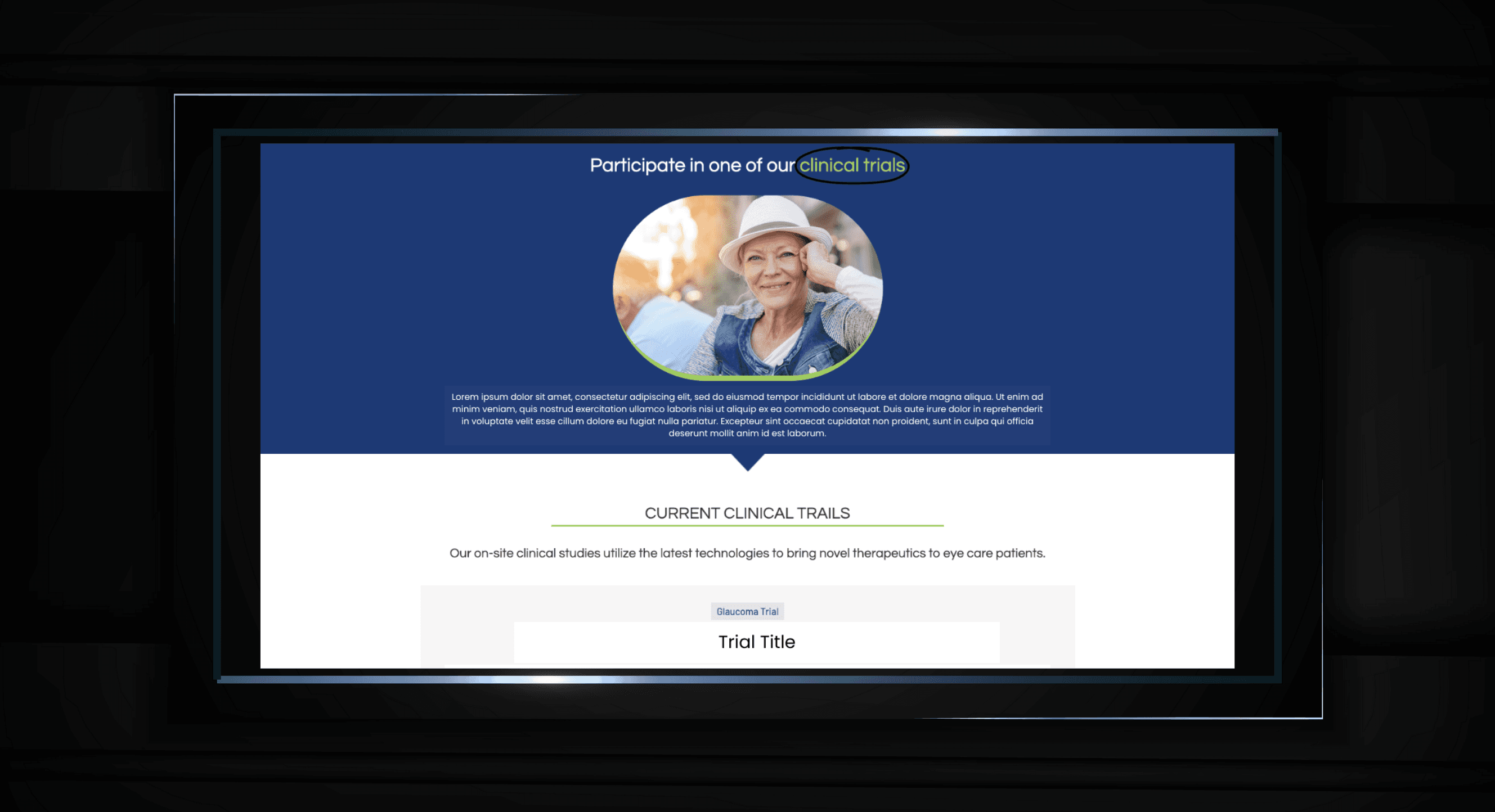
Clinical Trials Focus Page
Conclusion
This project required careful attention to user funnels and behavioral signals. By aligning structure with user intent, we reduced confusion, increased clarity, and guided patients toward meaningful action. The result: higher engagement, faster conversions, and a digital experience that better reflects the practice’s long-term care mission.
more projects


