Focus Over Friction
Visuals and details have been modified to respect confidentiality. Contact me for further context.
Client Industry
Healthcare · Ophthalmology
My Role(s)
UX Researcher · UI Designer · Front-End Developer
Project Focus
Simplified navigation · Reduced exit rates · Improved visual clarity

Tools/Methods:
Microsoft Clarity
Clickstream Analysis
Usability Testing
Google Analytics
Information Architecture
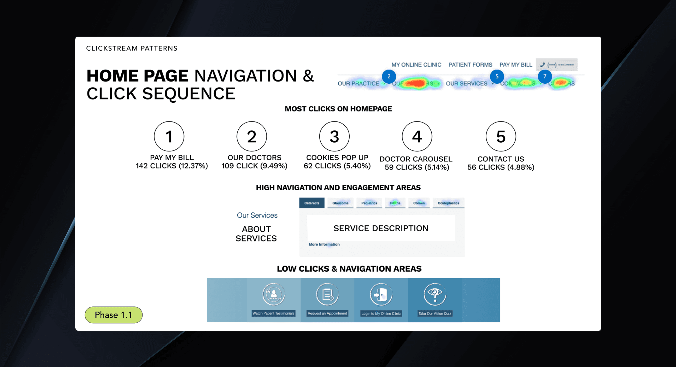
Problem
The website for a multi-specialty ophthalmic surgery practice was experiencing consistently high exit rates above the fold and a notable drop in page interaction. Excessive navigation options overwhelmed users and diluted the site’s focus, leading to poor engagement across key pages related to cataract, glaucoma, retina, cornea, and oculoplastics services.
Solution
Using Microsoft Clarity, Google Analytics, and clickstream analysis, I identified key friction points and redesigned the navigation and page structure. I simplified content, clarified CTAs, and developed a responsive front-end experience aimed at keeping users engaged and guiding them to key services.
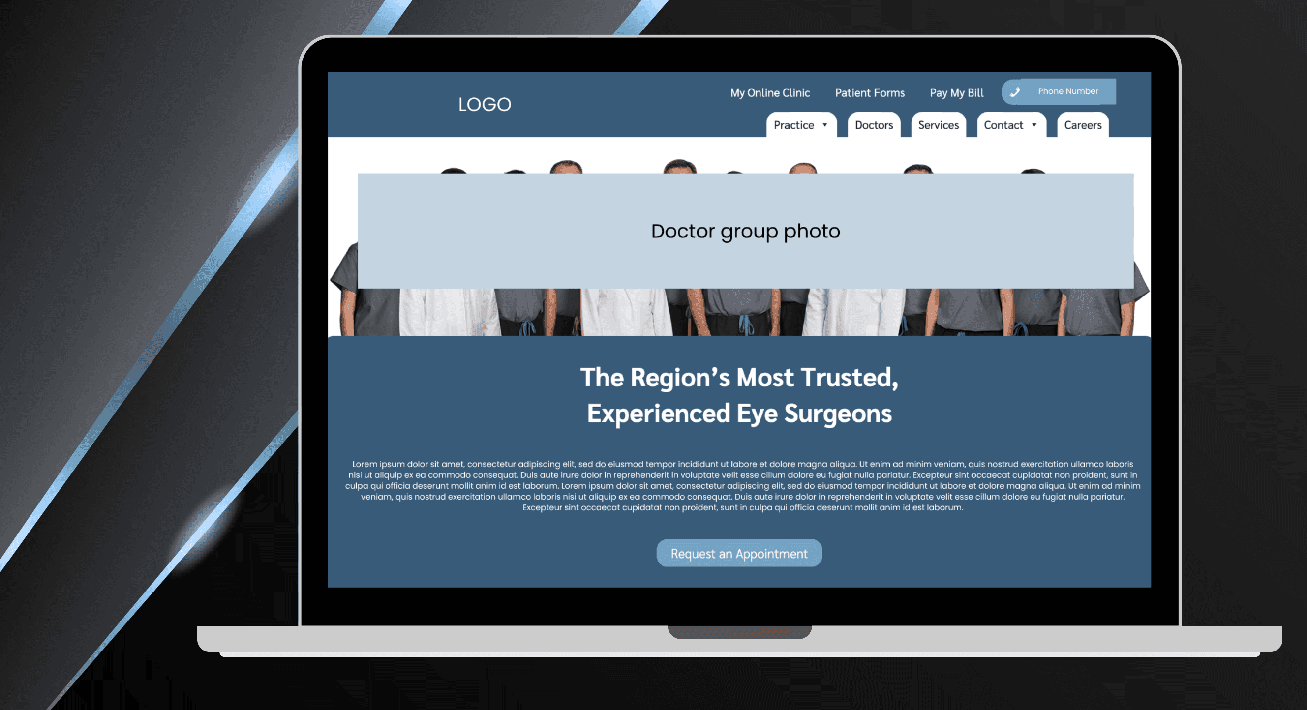
Key feature // 1
Simplified and restructured the navigation
I reorganized the navigation to reflect user priorities and reduce decision fatigue. This included consolidating excessive menu items, introducing clearer groupings, and supporting the layout with focused CTAs—all while minimizing clutter above the fold to help users orient themselves faster.
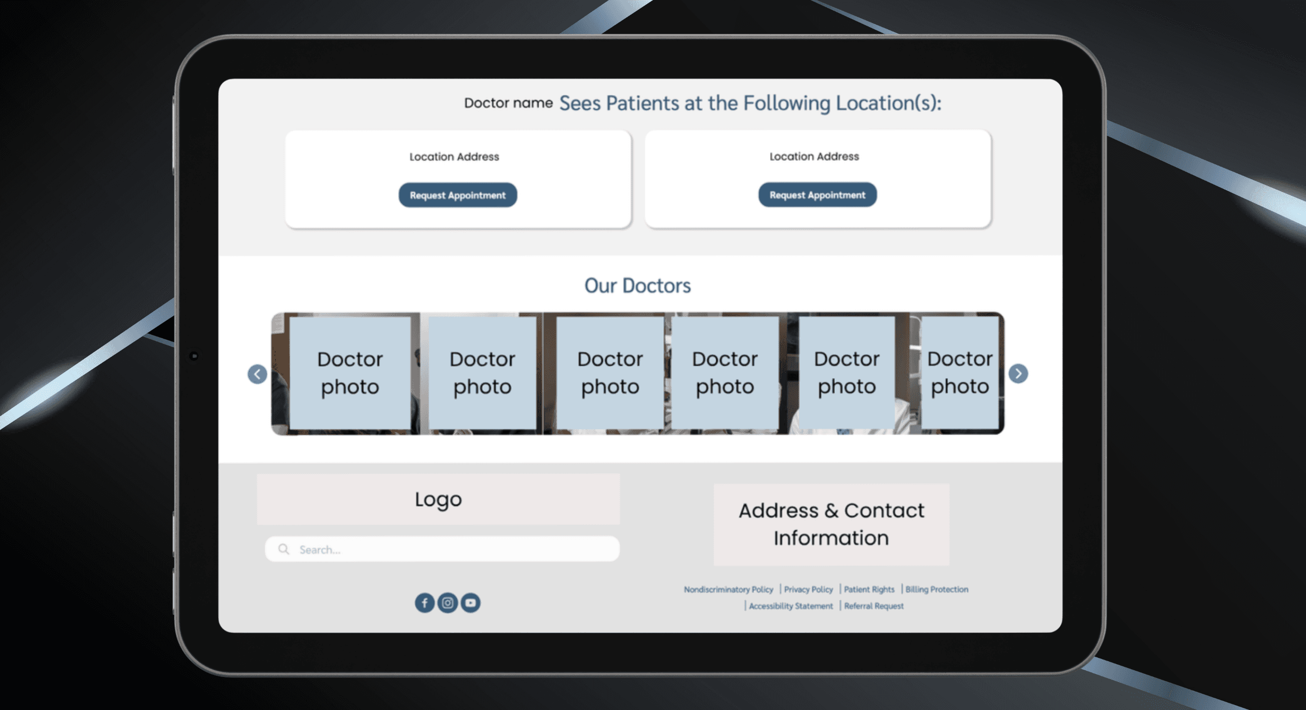
Key feature // 2
Improved visual scannability
With multiple doctors practicing across various locations, I improved content hierarchy and embedded visual markers to help users quickly determine which doctors were available at locations near them. These updates made it easier to scan, compare, and make decisions without needing to dig through dense content.
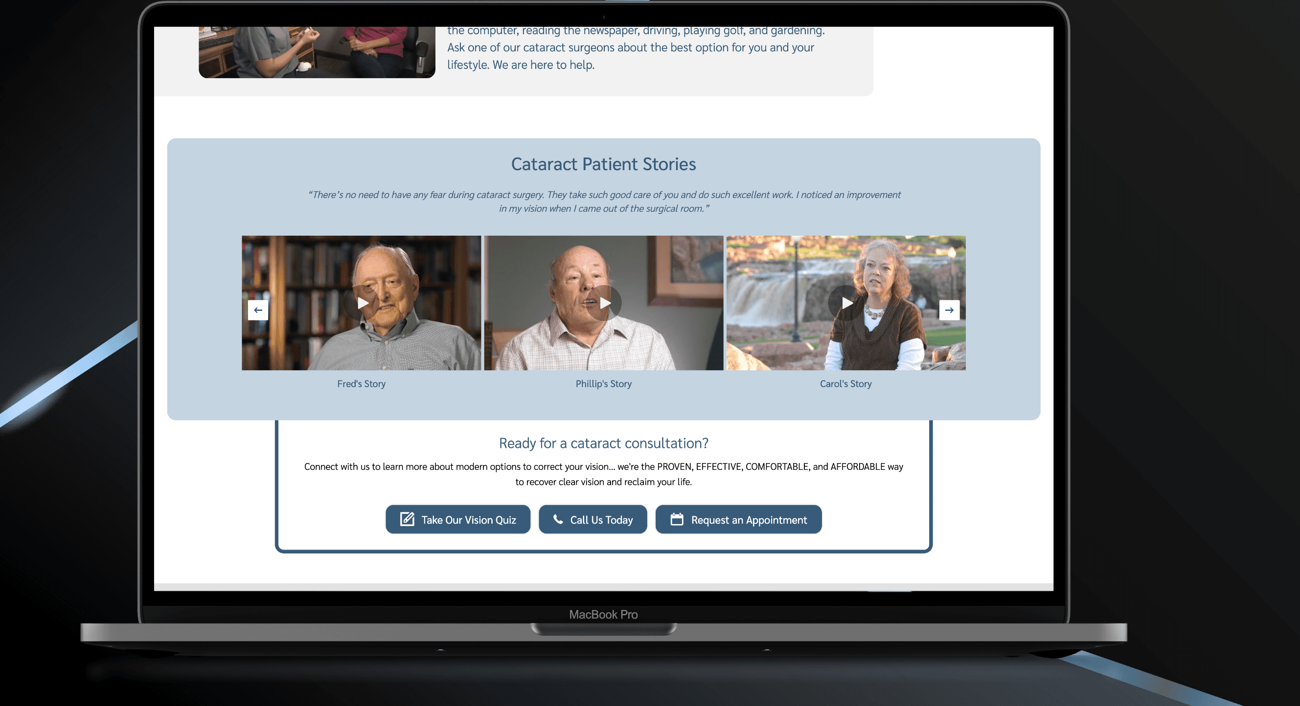
Key feature // 3
Reduced unnecessary content and reorganized key service pages for clarity
I grouped related services and introduced clearer, outcome-driven paths to care. Unnecessary or redundant content was removed, and service pages were restructured for better readability. I also developed the front-end code to match the redesigned experience—ensuring responsiveness, accessibility, and future scalability.
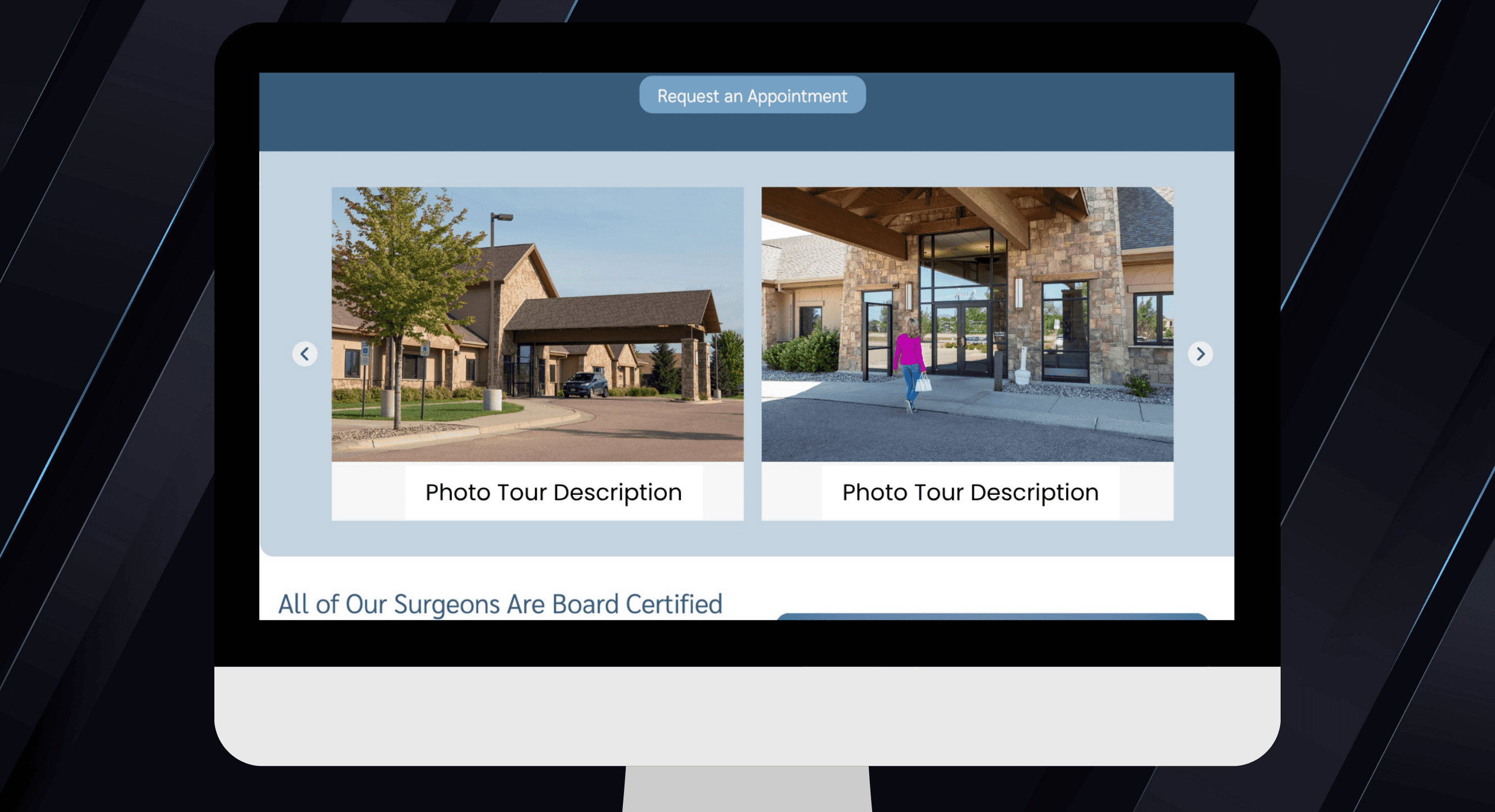
// redesign // New Photo Tour
Conclusion
Unfortunately, the project was not published due to the client ending services prior to launch. However, the redesign was fully developed and validated through testing, with strong indications of improved user flow and reduced friction across the site. This system is currently planned to be implemented for another practice with similar pain points.
more projects


