
From Drop-Offs to Direction
Visuals and details have been modified to respect confidentiality. Contact me for further context.
Client Industry
Healthcare · Ophthalmology
My Role(s)
UX Researcher · UI Designer · Front-End Developer
Project Focus
Patient usability · Navigation clarity · Call-to-action visibility

Tools/Methods:
Microsoft Clarity
Clickstream Analysis
Information Architecture
Google Analytics
Usability Testing
Problem
Patients visiting the website for cataract, glaucoma, LASIK, and corneal care were struggling to navigate the site effectively. Clickstream data revealed that navigation was barely being used, call-to-actions were unclear, and overall readability was poor — causing frustration and drop-offs in user journeys.
Solution
Through heat-map analysis, user session recordings, and clickstream data, I pinpointed pain points in the site structure and content presentation. I reorganized the information architecture, introduced well performing navigation into the correct location on the page, and clarified calls-to-action across the site.
Key feature // 1
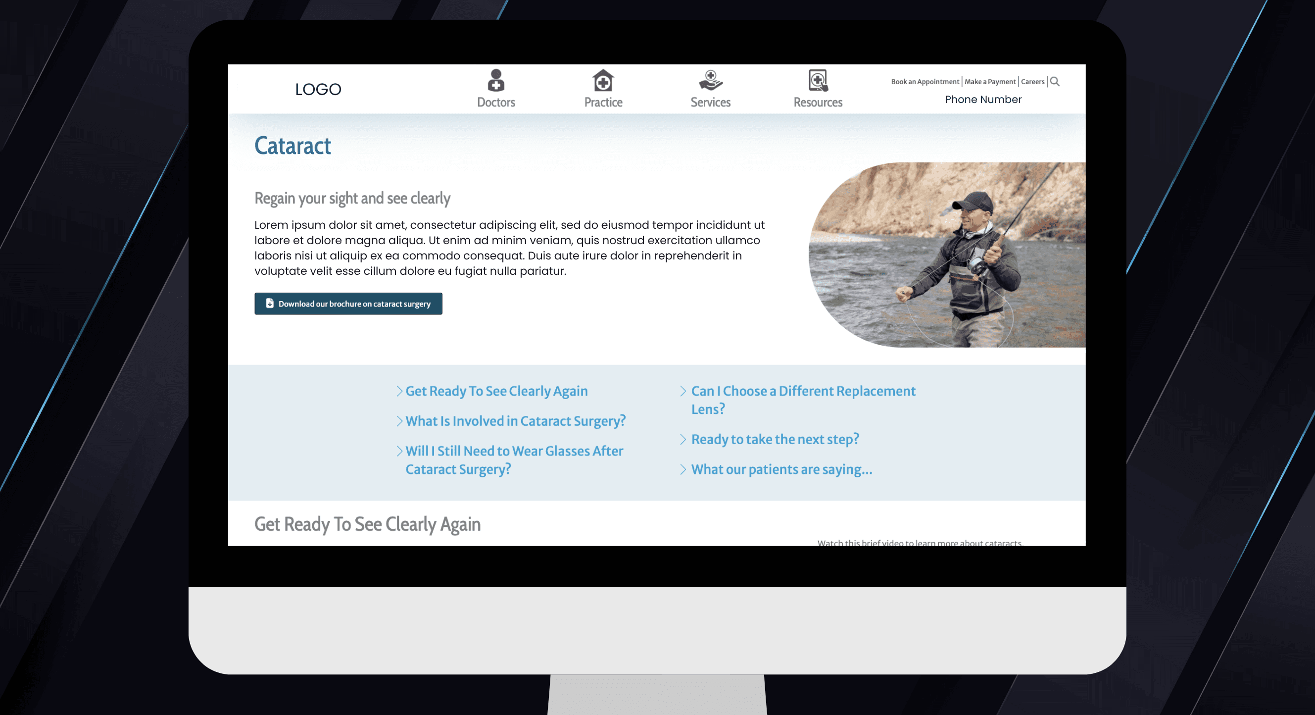
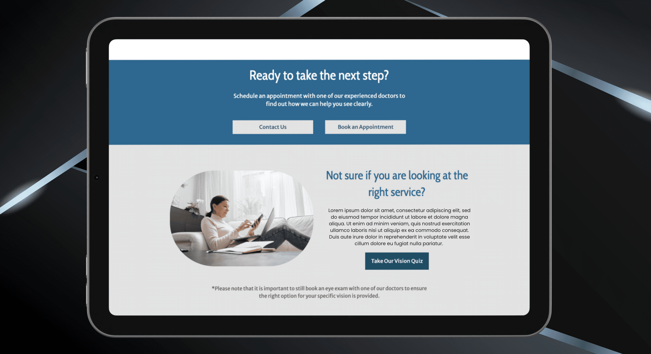
Redesigned CTAs to be clear, action-oriented, and visually distinct
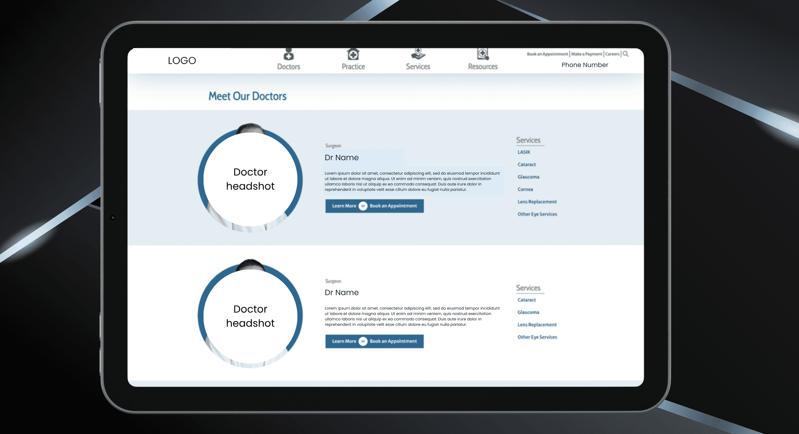
I simplified content-heavy layouts (especially on pages like the Doctors section) to support new, patient-centered user flows. These changes made it easier for users—especially those unfamiliar with ophthalmic terminology—to scan, understand, and act on the information relevant to their care needs.
Key feature // 2
Helped users engage with content more effectively
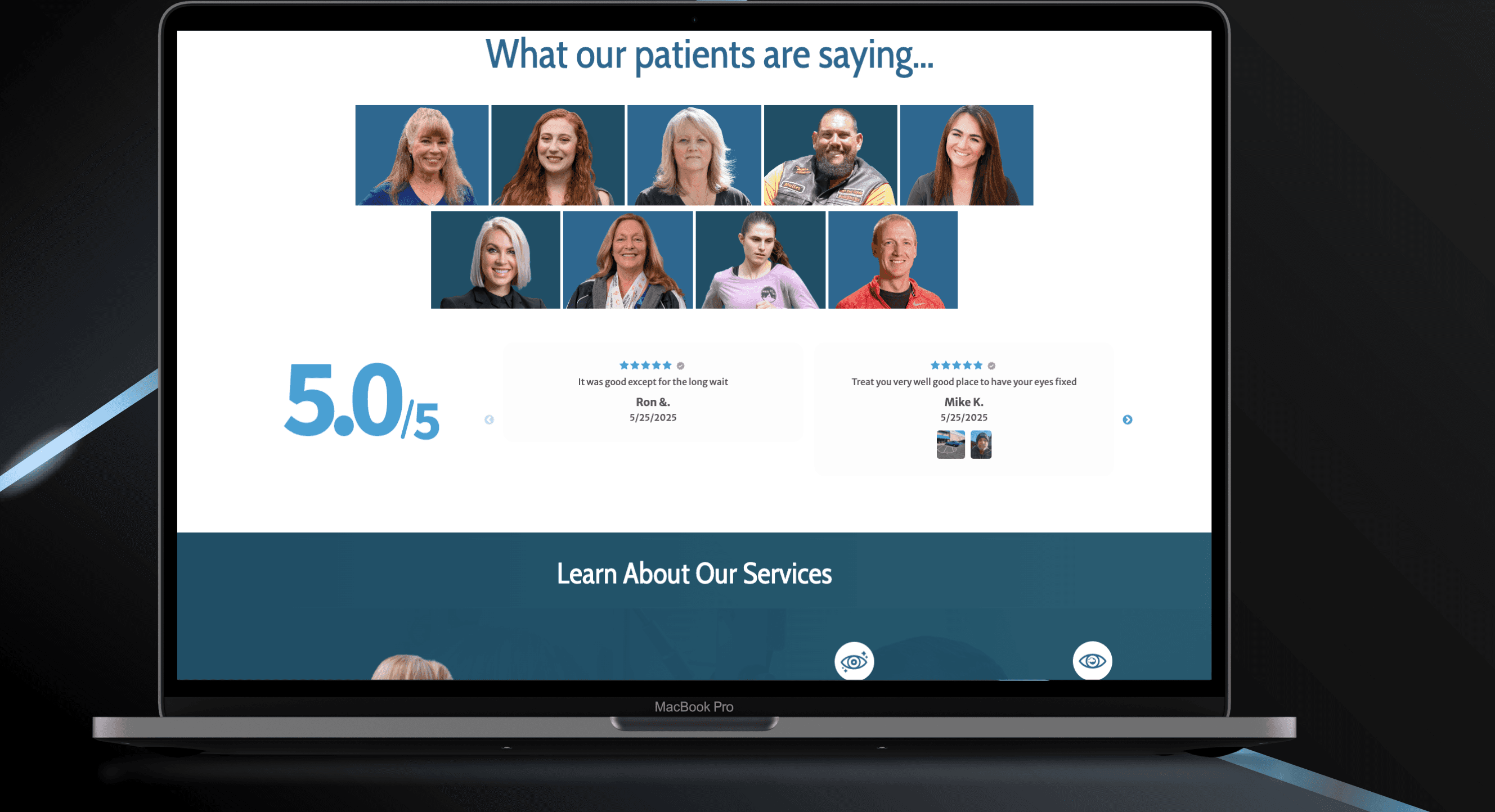
I introduced larger, high-contrast text and cleaner, responsive layouts to improve readability across screen sizes. We also ensured that high-performing content like patient testimonials remained accessible and visible, leveraging proven engagement from platforms like YouTube and Google to increase user trust and conversion.
Key feature // 3
Redesigned the site structure to improve content hierarchy
Users were getting lost in walls of unstructured content. I created a more scannable and segmented layout that reduced overwhelm and helped users move smoothly through key information. I also added tools like quick links and page anchors to help users jump directly to the content they were looking for.
Results
New site boosts engagement & intent
By focusing on a personalized user experience, the homepage has become a more engaging, relevant, and productive entry point that successfully guides users through an experience that feels uniquely theirs.
6.71%
Increased High Intent Users
The percentage of low-intent users dropped, while high-intent users nearly doubled. This shift shows that users were reaching their goals more efficiently and meaningfully.
3%-21%
Time on Site for Main Pages
The homepage, services, and doctor pages all saw increased dwell time—ranging from just over 3% to more than 21%—indicating deeper engagement even with content-heavy sections.
58%
Traffic Increase from Organic Searches
Focused content improvements and navigation fixes increased relevance for search engines—helping to drive more qualified traffic and contributing to the overall rise in high-intent engagement.
// redesign //Same CTA on every Service Page
Conclusion
Across the board, the new site is delivering deeper engagement and stronger user intent, particularly from high-interest pages like Services and Doctors.
more projects


